We have all been there – a shopping trip where you forget entirely how your home looks and opt for impulse buys that you feel you just can’t live without. The key to great interior design is having a keen eye and being organised. Understanding how colour works in a room as well as the placement of everything takes a lot of skill, but we have put together a list of the top 10 things to avoid so you can get it right first time.
1. Scale
When you walk into a room it is important that you see varying sizes and levels to the furniture and décor. It takes a well trained eye to decorate a room to scale. A lot of people put too many small things into their rooms, making it cluttered and distracting. Others put too many large or bulky items into a room which detracts from the size of the room and makes you feel penned in.
Mixing different shapes and heights will give the best overall scale to your room and will make it inviting, rather than oppressive.
2. Impulse Buying
We are all guilty of impulse purchases, both in the home and in our wardrobes. Sometimes you are out shopping and you fall in love with something that you feel the need to own immediately.
However, in interior design this won’t work. You need to plan your room before you buy anything and create a budget that you will stick to. Measure up your room and plan where you want specific items of furniture to go. With the plan in place, go into a showroom with the knowledge you need to kit out your room with the perfect furniture.
3. Not asking for help and advice
Being proud will do you no favours when designing a room. Sometimes when we look at something for too long it becomes harder and harder to see the obvious mistakes or things that need tweaking.
Invite a friend over and ask them for their honest opinion on colour choices, fabrics or placement of furniture. Sometimes a fresh set of eyes will make all the difference and prevent you from making simple mistakes.
Listening to advice doesn’t mean we have to take it so feel free to ask several different friends for their opinions and get an overall idea of what you should stick with and what needs reconsideration. If you really love the way your room looks then that is all that matters, but advice from those closest to you is usually a good idea.
4. Displaying things incorrectly
If you are a hoarder or collector of various pieces of art or accessories, then you need to get them into some sort of order to enable your room to look great and not feel cluttered.
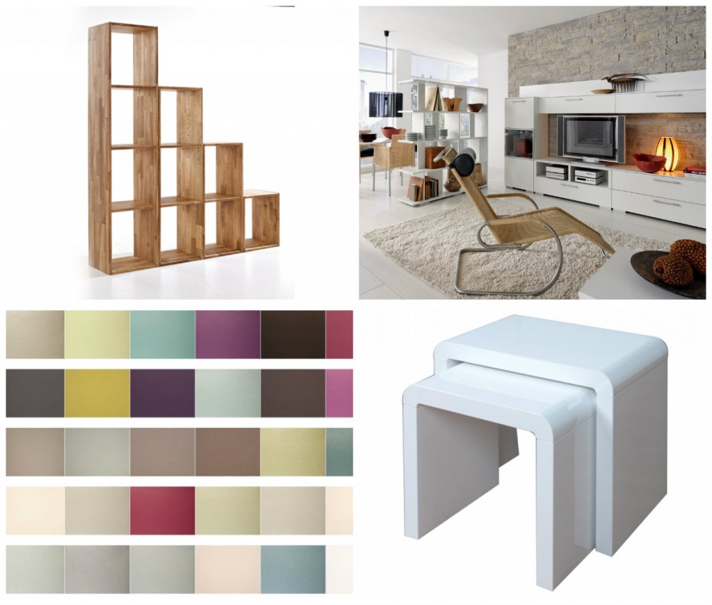
Don’t scatter your collections about and break them up. Instead, find a proper way to display them, such as in a bookcase like this one. By displaying them on different levels, but all in the same area, you can keep them in order and make more of a feature of them, rather than having them dotted about. You will notice a difference fairly quickly if you stick to this rule.
5. Hanging art incorrectly
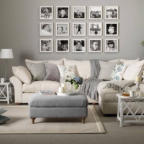
Whether you are an avid collector or just have one or two pieces you want to hang, think carefully before placing them anywhere. Trace your frames onto paper and cut them out. Tape them to the wall you decide you want to display your art on and see if it will work. This avoids any unnecessary nail holes that need to be filled and means you can move them about until you are completely sold on a certain part of the room in which to hang them.
Remember the above point about scale when hanging art, but try to have fun with your arrangements.
6. Don’t paint first
It is much easier to find a paint to match your fabrics and accessories than the other way around. With your budget and room size in mind, look at various home furnishings and accessories and, once you are happy with your choices, pick a paint shade from the textiles to match. You will realise very quickly what a difference this will make to your finished room. Everything will look well put together, rather than just being there because it matched your original paint colour.
7. Don’t be matchy matchy
Buying everything that matches will make your room lack character. It can take years to fully furnish and decorate your home. There is no rush so don’t just buy pieces of furniture for the sake of it.
By taking a chair from a reclamation yard and placing it in a room with a brand new nest of tables, like these, you will achieve a mismatched look that will stand the test of time and be very personal to you.
8. Always have a focal point
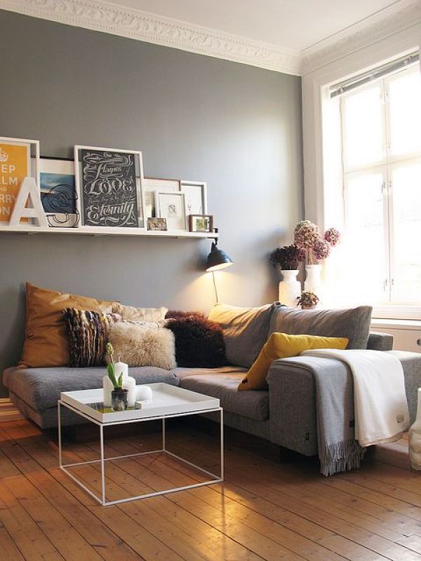
Every room needs one place where the eye can rest and take in details. Forgetting to give your room a focal point means risking your room not having a purpose.
Whether the focal point is a television on a stand (we like this unit) or an accent wall with picture frames on it, you should position the rest of the room pointing towards that focal point.
Don’t scatter furnishings about, but place them around the focal point. You will find that your room looks much more inviting if you achieve this and you and your guests will be more inclined to feel relaxed.
9. Ditch the things you hate
We all own pieces of furniture that we don’t particularly like. Whether it is a hand-me-down or you bought it on the spur of the moment and have regretted it ever since, you need to reconsider whether it is worth keeping or not. We shouldn’t have anything in our homes that we don’t love.
Why not give it a lick of paint or sell it and use the cash to buy something you love? Either way, set yourself free and fill your home with things you cherish and that make you happy.
10. Don’t forget to show your personality
Your home should be an extension of yourself. Ditch the boring, beige walls that lack character and add things that express your personality and what makes you tick. Your home should e somewhere that welcomes you in after a hard day at work, but it should also be welcoming to others. Put pieces of yourself everywhere and build a wonderful oasis of you.
Get it Right
Top left: Maximo Multipurpose Storage Cubes
Top right: Icon Alpine White Complete TV Unit
Bottom left: Vision Wallpaper
Bottom right: Atlantis Clarus White Gloss Nest of Tables
Images sourced via Pinterest. Credit: flickr.com.

