When we’re deliberating over new colours for the home, we’re often conditioned to avoid clashes and to use the colour wheel to find a complementary colour palette.
But in fact, clashing colours can be the basis for some amazing colour schemes, giving your room a real vibrancy that a perfectly coordinated palette lacks. Provided that you stick to colours that are equal in tonal strength, you’ll create a bold statement in your home that is modern, fresh and right on trend. Try using these clashing colour combinations in your rooms to make them really stand out:
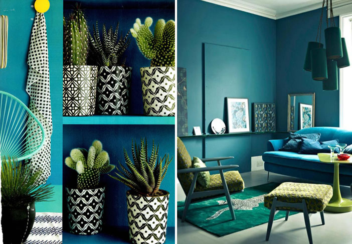
Blue and green: The old saying goes that blue and green should never be seen. In fact, these two colours work together just fine if you know how to use them. To make the combination work, bring together different shades of both blue and green, around the room. Incorporate accents in varying shades through your accessories – pictures, rugs, and vases – to help tie the scheme together.
Indigo and vibrant coral: These powerful tutti frutti colours are so energetic, they bring instant vitality into any room. Use the indigo as your main colour and add splashes of coral in your curtains, furniture, fabrics and accessories. Team with antique gold for a truly sophisticated, inspiring look.
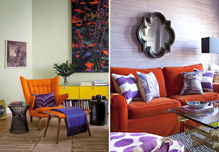
Orange and purple: Not for the feint hearted, an orange and purple colour scheme screams playful and mischievous with a seventies undertone. A couple of years ago, this was a huge hit in the fashion world and it has been popping up in the world of interiors ever since. For added zing, introduce a couple of small accessories in aqua blue and choose gold as your metallic.
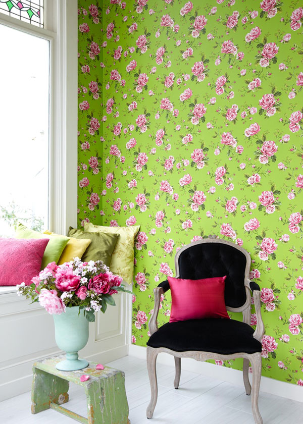
Lime green and hot pink: This sugar candy combination can look very sickly if overdone. The key to making this clash work is to use the pink as the accent colour and include both colours in patterns and prints around the room, rather than just using blocks of colour. Plain walls are broken up with layers of busy patterns mixed with bright bold images to give the room a vivid, animated feel. A splash of violet or a touch of lemon will take you back to your childhood, reminiscing of pick ‘n’ mix sweets and candy necklaces.
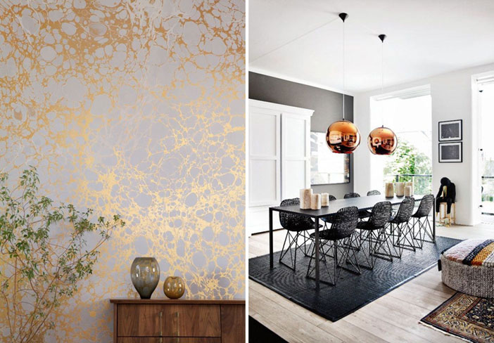
Clashing metals: We tend to stick to one metallic colour in the room – silver, gold or copper and never the twain shall meet. But in modern day décor, this rule is very much dead and buried – and a mix of metal colours works just fine in creating a lively and dynamic atmosphere. For a more subtle, balanced look, work with the same finish – so use shiny modern finishes together or antique finishes together but don’t blend the two.
A Splash of Clash
Colour clashes can create a fun, uplifting backdrop for any room but they make a bold statement and while many of us are willing to experiment with the concept in our wardrobe, we take a more cautious approach when it comes to our interior décor. If you’re a little nervous about using clashes in your colour scheme, start out with a few bold accessories. Your choice of interior design should be a personal reflection of you, so if a bold cocktail of zingy colour isn’t quite your thing, don’t be afraid to tone it down with neutrals so that the overall look is less overpowering.
In a smaller room, it’s a good idea to keep the walls plain and use your clashing palette on the furniture and accessories. This will ensure the room doesn’t look too cramped or overwhelming.
Room Flow
Although clashing colours work to add energy to an individual room’s décor, different clash combinations between adjoining rooms can be unsettling and inappropriate. As you walk through your home, your eye effectively carries the colour, and so if the colour schemes used in adjoining rooms don’t flow, it can feel uncomfortable. On the flip side, you don’t want the colour scheme throughout your house to be exactly the same as this would quickly become boring. The way to deal with this is to have a base colour that weaves a common thread through all adjacent rooms. This allows you to use green in a variety of combinations in different rooms, keeping the overall effect cheerful and provocative without feeling disconcerting.
Get the Look at Home
Take a look at our pick of colourful FADS furnishings for your home:
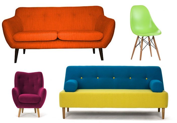
Top left: Stockholm Orange Fabric Sofa
Top right: Spider Lime Green Dining Chairs
Bottom left: Lilly Aubergine Chair
Bottom right: Flair Blue and Yellow Sofa
If you liked this post, then take a look at our thoughts on making clashing prints work in the home.
Image credits: homedecorfashions.com, blog.jelanieshop.com, interiordesignfiles.com, interiorguiden.se