The living room is the heart of your home, used by all the family and occupied for dozens of hours each week. As such, you want the room to be a comfortable, practical and well-decorated space to suit the whole family. You want to put your heart and soul in renovating this treasured space, and invest in ideas that’ll make the room perfect.
But you’re probably not sure where to start with the colour scheme – should you go with something contemporary like monochrome, or opt for something a little more classic and cosy?
Our foolproof guide will help you to release your internal interior designer and choose the perfect colour scheme. So put the kettle on and grab a pen and pad of paper!
1) Get inspired
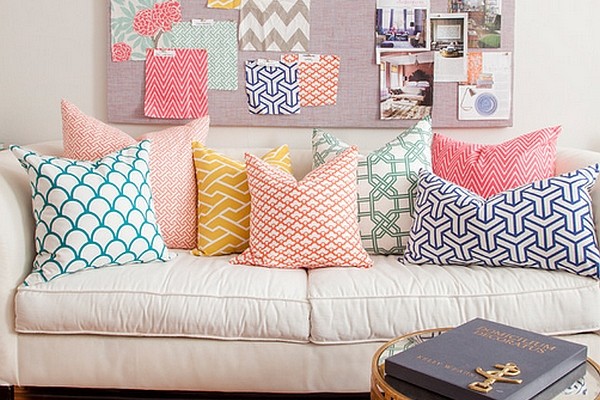
 Inspiration is crucial when it comes to redecorating. If you really have no clue about the colours you’d like for your room, start looking around your home for ideas. A favourite pair of shoes, dress, fabric swatch or pretty mug may act as a starting point!
Start scouring through interior design magazines and websites for ideas too. Collect anything that stands out to you and create a scrapbook of ideas, either virtual (on Pinterest) or on paper. Don’t tie yourself down to only making one scrapbook collage or Pinterest board – create several centred around different themes and colours – for example ‘Moroccan blue’, or ‘spring pastels.’ It’s likely you’ll start leaning towards one idea as you gather more and more inspiration.
As you narrow down your selections, select one colour from the colour wheel – the colour you’re most drawn to. This will be your living room’s base colour.
Inspiration:
- Pinterest – Home Decor Category
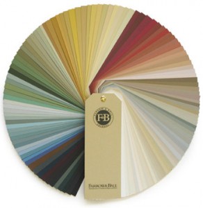
- Farrow & Ball on Pinterest
- Dulux on Pinterest
- Farrow & Ball’s ‘Introduction to Choosing Colour’
- Red Online’s virtual scrapbook of decorating ideas
- Use ‘Chip It‘ to turn photos into an instant colour palettes!
- Martha Stewart colour palette ideas
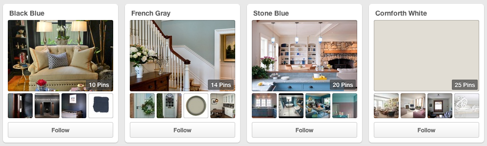
Farrow & Ball on Pinterest
2) Choose your scheme ‘rule’
Now you’ve chosen your ‘base’, it’s time to think about the other colours you’re going to pair with it. This can be tricky if you have limited interior design experience, but never fear, there’s a cheat! Abide by one of these three ‘rules’ and you cannot go wrong:
- Pair with tonal colours – Use varying tones of your base colour throughout the room (e.g. varying shades of beige, browns) or use more than one colour, but ensure they have the same depth of tone (e.g. different dark, rustic colours)
- Or pair with harmonious colours – Pick a colour that sits next to your base colour on the colour wheel. These two colours are usually easy on the eye together. Use varying shades of each in your room for a successful scheme.
- Or pair with complimentary colours – Choose a colour that sits opposite your base on the colour wheel (E.g. blue and yellow). You’ll find the colour is contrasting, which can often be a little more difficult to work with. As such, you’ll need to find the sweet spot between making an impact and creating something that’s easy to live with!
Resource: Adobe Kuler is a free website with an interactive colour wheel. Pick your base colour, choose the colour ‘rules’ you’d like to use (monochrome, complimentary etc) and play with the sliders until you find hues you’re happy with!
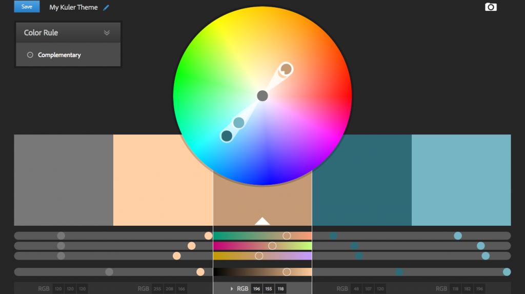
Adobe Kuler
3) Experiment with the Dulux Colour Click app
 Dulux’s free visualiser app lets you paint the room and experiment with colours, without having to even leave the sofa! Using your smart phone or tablet, you can use the latest in augmented reality technology to apply colours to the wall with just one tap! You can even save screenshots to send to your partner! Pretty handy.
We love this app because you can experiment with bright and bold colours without even buying a tin of paint. Worried that your favourite shade of orange is just too bright for your whole room? Worried that light blue walls will clash with your sofa? Test it for yourself by using the Visualizer!
4) Get over your fears and doubts
When it comes to choosing colours, try and let go a little. Cast aside those fears and forget your doubts. When your heart is shouting out for bright blue but your head is saying no, take a minute to think about the worst case scenario: the bottom line is that painting is quite a cheap and easy process, so if you hate the colour, it can be redone in just a few hours for very little expense. This new found freedom will allow you to remain open to ideas and suggestions as you plan your redesign.
Some of our favourites
Here are some of our favourite colour schemes featured here on the FADS.co.uk website:
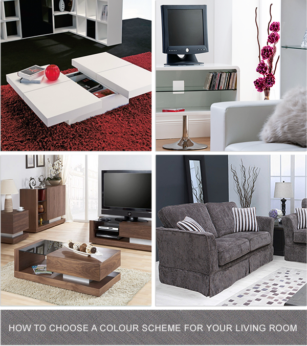
From top left, clockwise:
Dark walls, white high gloss furniture and bold red accents, via Kyoto Coffee Table
White and mink tones with accents of bright pink, via Toscana TV Unit
Medium brown wood furniture with beige and metallic accents, via Jual Walnut Unit
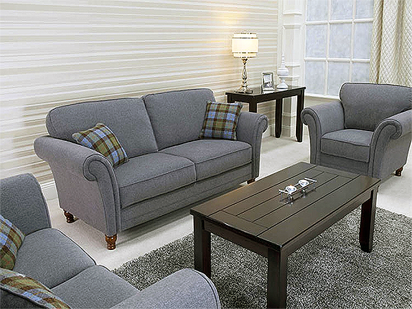
Tonal grey (which is the new black!) and steely lilac, via Hayley 2-Seater Sofa

A Quick Guide to Redecorating Your Living Room - Kath's BlogKath's Blog
[…] your personality, and the way that you live, so if you have always stuck for more neutral and quite bland colour schemes, then why not liven things up a little bit? Add a splash of colour by adding a feature wall, or add a wallpaper that grabs your […]