We are big fans of Abigail Ahern’s glamorous interiors, so you can imagine how excited we were when she agreed to spill the beans on her signature look – thanks Abigail!
For me, beautiful interiors should always produce a gut-level, emotional response. Depending on what you want to achieve, the coolest rooms should make your heart skip a beat, your jaw hit the floor, or a squishy feeling of contentment wash over you the second you walk through the door. I always want to achieve glamorous, luxurious spaces that still feel laidback and not uptight and I’m inspired by a sort of gentleman’s club vibe. So dark, intriguing spaces that seem to wrap you up in the squishiest of blankets when you enter the room. That’s how I want my home to make me feel anyway! Why settle for less?
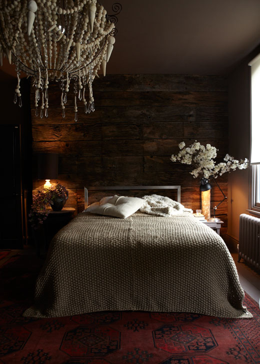
It’s not the easiest thing to define my look, as I reference so many different periods and styles and nothing really matches, yet it all makes perfect sense. To get the eclectic look right you really need to manage the fine balance between achingly cool, and tipping straight over into crazy! Although I enjoy breaking the rules when it comes to decorating, I do have some top tips for taking any room to the next level. It’s not the easiest look to pull off, but once you do you’ll have a space that you never want to leave…
Colour
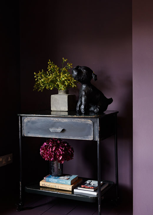
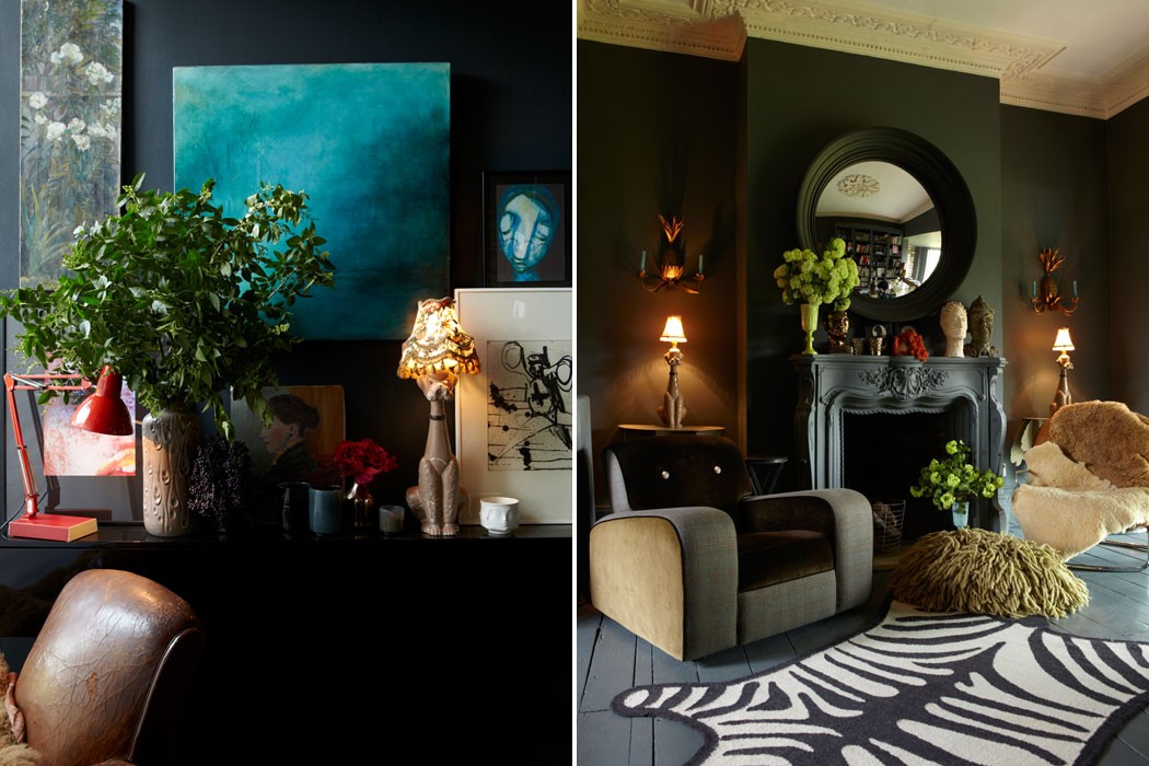
I am evangelical about dark inky hues, and they’ve become my signature colours. I spent months working on my favourite seductive dark shades when I was creating my paint range. I think it’s fair to say I’m obsessed. People are always terrified of painting their rooms in dark shades, but they’re the most invigorating, glamorous and sophisticated colours around. Once you’ve gone over to the dark side you certainly won’t go back! Plus everything looks cooler against a dark background, so that helps.
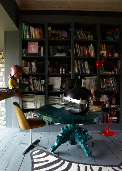
For a more sophisticated look I like to have a really reigned-in colour palette with only two or three main colours, and ramp it up with just the odd shots of intoxicating brights or metallic accents. This could be a cluster of vases, a splash of bright artwork, a metallic leather cushion… I find that shine and sparkle really brings a room alive, particularly against dark walls.
Statement Features
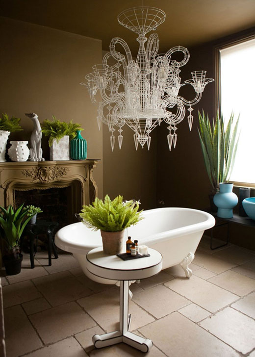
These could be an incredible pendant or chandelier, oversized mirrors or a fantastic piece of artwork. My biggest tip though is not to stop at just one. I love to go bold with interiors, and as far as I’m concerned one statement feature isn’t enough! For an intriguing space, you need your eyes to be drawn in different directions and rove around the room. If you only have one statement piece you can read the room in a second and it feels too “flat”. Too many statements and it can get a little crazy – as so often in interiors, three is the magic number here.
Lighting
I am obsessed with getting lighting right. Honestly obsessed – when guests arrive I have to stop myself saying “Don’t you think the lighting is darn amazing in here? Put your drink down for a second and just look AT IT’”. Obviously I don’t, but it’s difficult when you’ve achieved the most beautiful, magical little glowing pockets of light perfectly balanced throughout a room. It’s a thing of beauty!
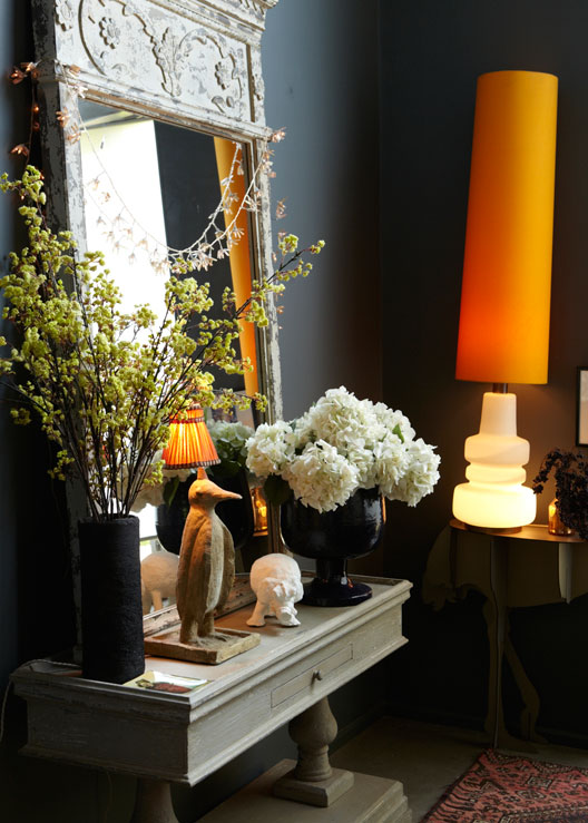
The key to this look is to think of your overheads merely as co-conspirators – you’ll need oodles of lamps and sidelights to help them out. They add depth and intrigue, and instantly make anywhere feel cosier. I always recommend at least 8 lamps or light sources in a room. This is usually the point when jaws hit floor in disbelief at my Design School, but it really does make the biggest difference!
Texture
I play around with textures a lot to make a space feel comfortable and welcoming. Texture is a tactile and visual treat that adds layers of softness and contrast, and stops a room coming off too one-dimensional. And the best thing is that unlike pattern or colour, you can’t overdose on it. It’s all about the juxtaposition of different textures, so maybe marble or metal against slubby textiles and sheepskins, leather and concrete up against velvet and so on. Pitting rough against smooth, and glossy surfaces against softer textures is what makes the magic happen.
Flowers or Plants
I always add some flowers, plants or greenery to a space, They bring life and colour to any room, and are one of the quickest and easiest ways to perk up a space. Most of us can’t afford beautiful bouquets of fresh flowers all the time, so the solution is definitely to go faux. I have real flowers on my dining room table and fake ones everywhere else – they’re so beautiful and realistic that people never know they’re fauxs!
Personality
The final, most important element of any amazing room is bags of personality. The best interiors shouldn’t feel like soulless show homes, all perfect symmetry and matching furniture. Don’t be afraid to blend lots of influences and styles, and dabble with all sorts of things you love. Try raw with refined, traditional with eclectic – whatever floats your boat! A home should be an extension of your personality, so go with your gut, ignore trends and always buy what you love.
Abigail’s latest book, COLOUR, is now available!

Abigail AhernAbigail Ahern - Have you seen? Blogs to follow
[…] For me, beautiful interiors should always produce a gut-level, emotional response. Depending on what you want to achieve, the coolest rooms should make your heart skip a beat, your jaw hit the floor, or a squishy feeling of contentment wash over you the second you walk through the door. I always want to achieve glamorous, luxurious spaces that still feel laidback and not uptight and I’m inspired by a sort of gentleman’s club vibe. So dark, intriguing spaces that seem to wrap you up in the squishiest of blankets when you enter the room. That’s how I want my home to make me feel anyway! Head over to FADS to read the full article with my top tips. […]
Frederik Premier
Great post,..covers the basics, yet so insightful. Nice blog btw, I came here through AA. Will follow!