I know a lot of people may cringe at the title of my post today. And understandably, we’ve been influenced as a society to see pink as “girly” and “childish” although you may be surprised to find that pink was considered a masculine colour (red for men, pink for boys) all the way until around WWII.
Look it up, it’s a fascinating history. However, I want to dispel some of the myths surrounding the gender stereotypes of this colour and show how anyone can use pink successfully in their interiors.
Let’s just state for the record that I really hate using words like ‘masculine’ and ‘feminine’ to describe colours. It’s all a bit crazy that in this day and age we’re assigning genders to something as arbitrary as colour but until we have better descriptors that give people an instant understanding of what I mean by these kinds of elements of design, then unfortunately, I’m stuck with using them! So I shall proceed, albeit grudgingly.
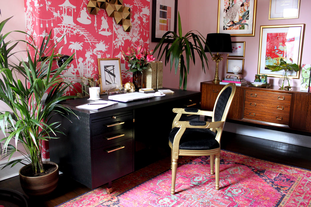
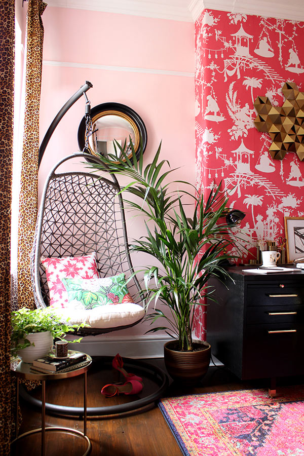
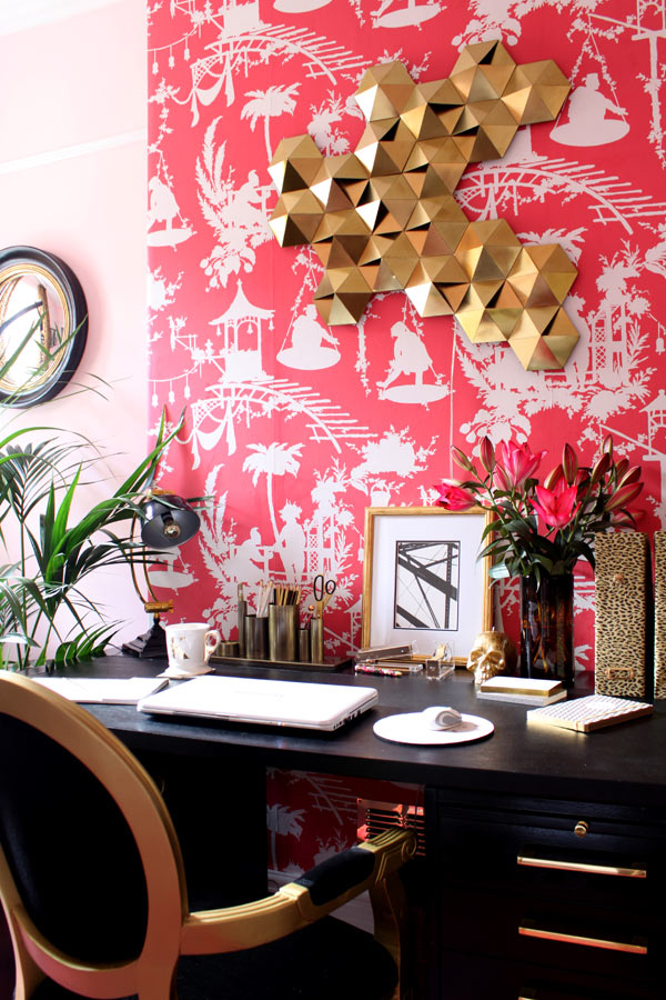
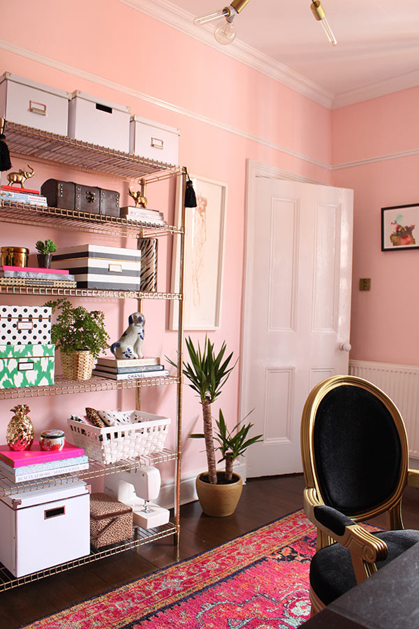
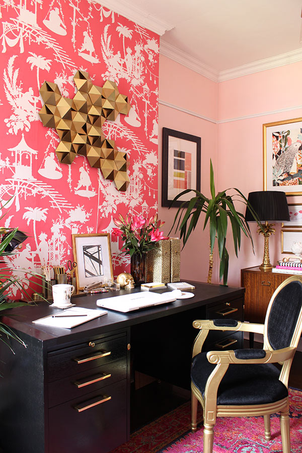
Now I might be a bit biased because I recently painted my home office in the most wonderful shade of blush pink and I’m using the images of my office to make my points. However, I think the trick to using pink successfully and to give it a more ‘grown up’ vibe is to contrast the light airy-ness of the colour with the most ‘masculine’ of all shades – black.
Black gives pale pink an edge – it creates tension with these two polar opposites each bringing their own intrigue to the space. Black will always ground a space (indeed, I think it should be used at least in small amounts in nearly every room in the home!) and suddenly pink looks more ‘rock chick’ than ‘Barbie’s dream house.’
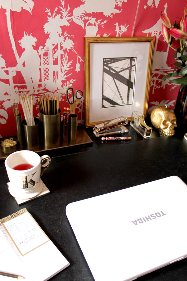
Want to up the glamour stakes with pink? Bring in gold. This ‘metal of the moment’ is having a surge of popularity and for good reason – it’s a warm metal and adds so much more old school sophistication than chrome or stainless steel ever could.
And finally, consider using a contrasting colour on the colour wheel. In my office, I chose to use quite a bit of green – by way of the plants mostly but also in cushions and artwork – to provide yet another contrast with the pink.
Using these few tips will instantly create that rock chic glamour that’s perfectly grown up chic! Is this a colour you would use in your home? I’d love to hear from you in the comments!
Get the Look
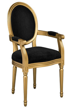
Do you like the chair featured in this super-glam home office? You can buy the Louis black velvet and gold finish chair from FADS for £179.99.
All images in this post: Swoon Worthy

